Why use Sankey charts?
Communicate meaningfully amidst data overload
We work in a data-driven world, full of numbers, complexities, and unseen interconnectedness. Anyone working with figures must not only understand numbers but also tell narratives that capture attention and ignite understanding. The ability to decipher and communicate insights is a crucial skill.
Sankey charts facilitate storytelling through data by revealing insights and connections. Complexity meets clarity and data turns into captivating narratives.
Turn numbers into visual narratives
Every figure has a story to tell, a journey that it embarks upon as it goes from its origin to its destination. Traditional tables and conventional charts are not ideal to navigate complexity. They often fall short to depict the magnitude and directionality of numbers. Reading rows and columns of figures may feel boring for the audience.
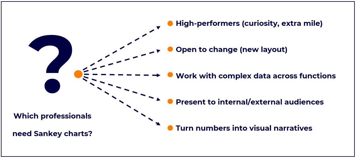
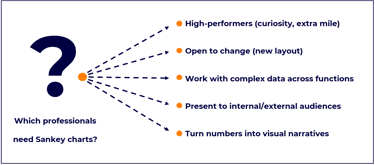
On the contrary, Sankey charts display data through a series of connecting arrows to show the movement and distribution of flow between categories. Adaptable to a wide variety of data sets, their design proves useful for a variety of industries (e.g., Finance, Supply Chain, Procurement, Marketing, Project Management, Consulting). Sankey charts transform numbers into visual and engaging narratives, making the abstract tangible and the complex comprehensible. Storytelling, drawing conclusions, and making decisions becomes much easier.
For example, imagine you are looking at the Profit & Loss statement of a company. While informative for finance professionals, the traditional tabular format used for P&L is usually uninspiring for any external audience. Where do Revenues come from? How do the Costs of Goods Sold compare to Revenues and Gross Margin? How does the Gross Margin cover SG&A (operating expenses) of the business? A Sankey chart answers these questions in an engaging, informative, and conclusive way.
As another example, imagine you’re tasked with presenting the flow of materials in a global supply chain. While rows and columns of data might leave your audience feeling overwhelmed, a Sankey chart becomes a map that guides your listeners through the journey of each material, revealing the twists, turns, and intersections along the way. Instead of a unimaginative table full of numbers, your data becomes now a streamlined visual narrative that’s easy to follow.
Blend substance with aesthetics
Presenting numbers entails more than merely conveying information; it’s about focusing the attention of the audience to what matters most by blending the rigidity of data with the elegance of design. A presentation should be simultaneously informative, conclusive, and visually appealing. It should both enlighten and delight. Executives do not care for monotonous slides full of numbers. They ask primarily for narratives bringing numbers to life.
Enhance Data Literacy
Sankey charts are your allies when collaborating cross-functionally and communicating with external audiences.
For example, imagine that you work in Finance and must present the financials to the Sales and Operations teams. Telling them that a sales increase/decrease of 3% generated an EBITDA % lift/dip of 50 bps is not necessarily how your colleagues think and speak. Instead, you could use a Sankey chart as a translator. Show them which revenues streams have overperformed and underperformed. Show them how your gross margin expanded or contracted. Turn your financials into a visual narrative to connect dots and build bridges across functions. When all functions speak the same langage, the organization gets empowered.